With blueprints in hand, I set about the task of creating the new interface.
There are several similarities between designing a website and designing an interface. Both tend to revolve around creating systems, and at their core, both are about the presentation of information to a user.
There are, however, differences between these two tasks. The goal of an interface, particularly a CMS interface, is to ensure that the content is the focus. On a website the chrome of a design and the content function as a single presentation for the “look” or “feeling” of a company. In an interface, the content alone should have the most focus, and the chrome should only seek to enhance it.
An interface also needs to account for user manipulation of said content. The actions that a user can perform must be evident, and it must be clear how a user’s content fits within the interface. In this case, I already had a wireframe for how the interface was to be structured, but I still needed to consider the hierarchy of the elements, what was most important? What could be de-emphasized?
My first drafts of the interface attempted to address those questions within the framework that was already laid out.
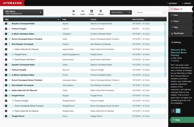
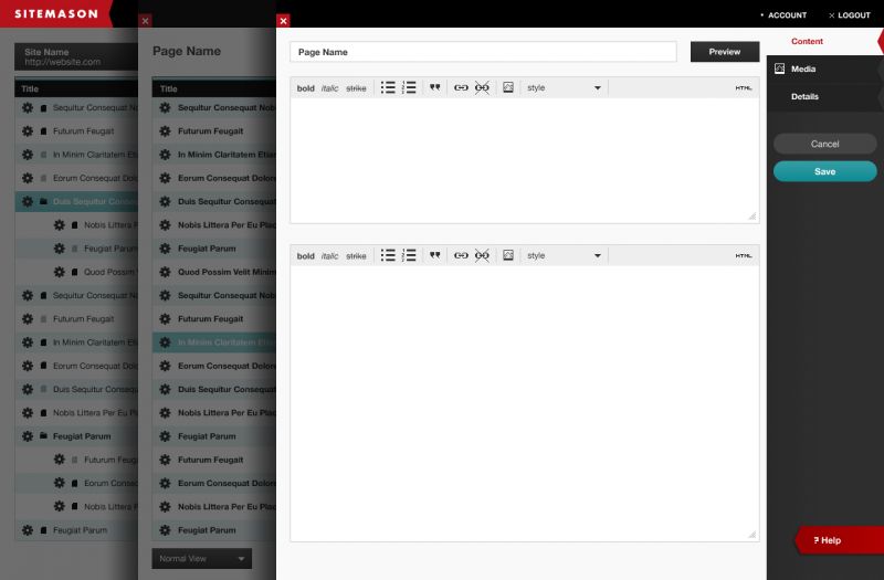
The first thing a user is going to see is their content, front and center. The settings bar and the heading bar were given dark backgrounds to de-emphasize their visibility, but we did choose to visually connect the current tab to the available tabs via color.
Each round I sent the team had a list of revisions attached, but the final look remained fairly close to these early drafts. Changes ended up revolving around particular widgets and workflows, and most of the work involved adding more and more screens to the rounds of drafts. By the end I was sending up to 16 individual screens of the CMS per revision.
Some features are you are seeing in these screens that didn’t end up in the actual launch of Sitemason 6 include:
- Quick menu on list items (gear icon)
- View selector for list views
- Inline help system
Which isn’t to say that these features won’t make an appearance in the future, but just that as with any product, priorities were decided upon, and they didn’t make the initial cut. After I handed off my PSDs, I had to prepare the icons.
The Icons
In the mockup stage, you may have noticed the icons looking slightly different than what ultimately shipped. After a lot of experimentation on my part, I started creating tiny, pixel-based icons in the actual Photoshop document as I went along. Initially they were just to get a feel for placement, but as I started adding more, I started to really like the feeling of precision they gave the interface. Conceptually, the pixel was also a great metaphor for Sitemason’s philosophy of “build on us,” as pixels are literally the building blocks of a screen.

Going into production, however, a pixel based icon set wouldn’t have been very efficient. We wanted to be sure that the interface looked great not only on the desktop, but also on the high-resolution screens of handheld devices. For a pixel-based icon set, this would have meant potentially creating the assets at multiple sizes and swapping them in and out based on the current device, a lot of unneeded complexity. To address this, we decided to create an icon font.
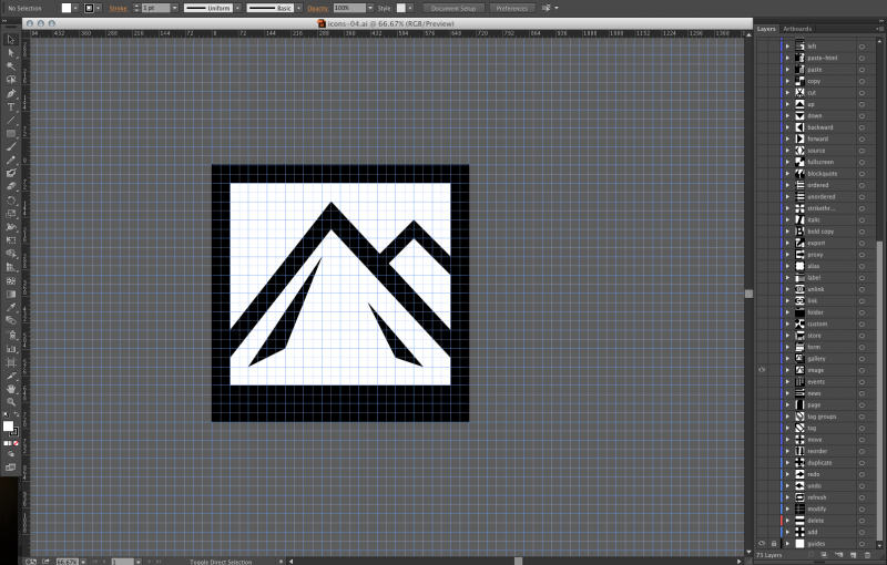
I started with a single, layered Illustrator file to create the icons. I wanted to be sure the icons felt like a family, so I used a particular grid to base all my icons around. Even though I was abandoning the sharpness of individual pixels, I tried to capture that feeling by using angles and straight lines in the icons.

There are currently 78 icons in total, though not all are being used. The great thing about an icon font is that as the CMS features grow, I can add new icons easily and simply drop in a new version of the font file. Eventually I abandoned that original Illustrator file and my current process involves a folder full of SVG files that I import into the powerful IcoMoon service to build the font. Some things I learned along the way:
- Vectors aren’t free, you still need to optimize shapes for viewing at small and large sizes
- Simplicity is key, using known metaphors will help users understand icons more quickly
- Watch your antialiasing, icon fonts will look bulky with sub-pixel rendering
The Buildout
For a time, my involvement ended there. Sitemason had my PSDs and now they had the icon font, this was March of 2012. In December of 2012, Signal Hill started working with Sitemason on a separate, but related issue, and that was encouraging and building a community of users around the Sitemason platform. By this point the team already had a working version of the interface, and we were seeing previews and demos of it as the features were completed. After the community team meeting, I was asked to stay on for an extra day so we could review the current state of the interface together.

The majority of our discussion that day was focused around user workflow, but a fair bit was also about my thoughts regarding the translation of my PSD to live HTML and CSS. Generally I was quite happy. The technology was very impressive, and the speed with which data could be loaded into the interface was a vast improvement over the older system. When pressed, however, I did have some opinions about how this or that was a few pixels off, and how I would change a few things now that I see them live. All of a sudden, I was given access to the SASS file.
The SASS
The Sitemason environment is set up with a development server that only certain user accounts get access to, and then a live server that regular users get. I was given an account on the development server so that my CSS changes would only be reflected in my account. In the beginning, my changes were quite modest, tweak a color, change some padding, but as I got more comfortable with the file, I started re-styling and re-thinking entire sections of the interface.
I’ve known for a long time that Photoshop is never going to be an accurate prediction of how a site will look in the browser. It comes down to much more than font rendering, it’s also about live versus static. In a live document, the presentation is infinitely more malleable. Your design now has a toolbar on top of it, and a scroll bar to the side. It is now floating on top of other windows and individual elements are now responding to user interaction and window resizing.
While my initial screens were highly detailed and “pixel-perfect,” I ended up doing a fair amount of live styling in the browser with the code. Seeing how a panel looks after it animated in changed the way I was thinking about the close button, and experiencing live switching of tabs make me re-think how they played into the hierarchy of the interface.
After several weeks of tweaking and re-designing, I hopped onto a Google Hangout with the Sitemason team and we went over the changes. They were pleased with the results, and after much more work on the back and front end, we launched with an interface that was both far from, yet totally related to where we started.

Can you spot the differences? There’s a lot to consider, but overall, I still get a jolt of happiness every time I log in. The product is a result of a synergy between the Sitemason developers, who are capable of managing the intense technical pieces that are way beyond my capabilities, and me, a designer with enough code sense and aesthetic skill to be able to create what I want to see.
Is it perfect? I would have to say no. The reality is that a project of this scope and magnitude being managed by an extremely dedicated, but ultimately small, team is a huge undertaking. The CMS is still in constant evolution, and users and developers are literally shaping what it will become. The team at Sitemason is working every day on improving, fixing, and polishing their product.
I was honored that I got to play a small role in the crafting of this interface, and that they continue to request my feedback and insight as their platform grows. To Billy, Tim, Travis, Thomas, and Byron, it’s been a great ride, and the road ahead is looking really, really good.