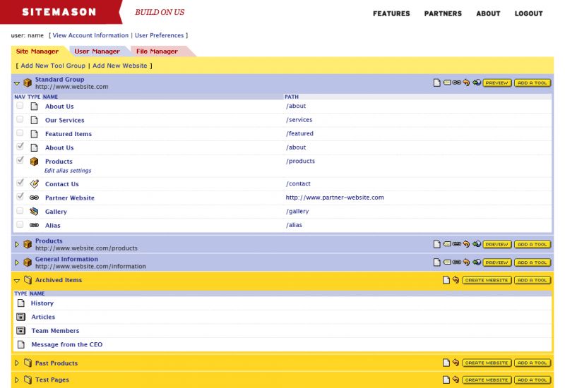
To begin our journey, let us first recall where we started.

This is the Sitemason that I was first exposed to as a new employee of Signal Hill, a firm that worked exclusively with the platform. I had to start building sites with them right away, but quickly got the hang of it. The design, while somewhat dated, was still quite effective. Buried within each tool was a plethora of options that enabled me to build powerful and dynamic sites much quicker than I was used to.
Over time, with the help of the team at Sitemason, my comfort with the platform grew. At around the same time, Sitemason was starting to brand themselves as a platform for agencies and freelancers. They wanted their customers to be code savvy enough to build templates themselves so that they could focus on their CMS and handling all the back-end technologies. When it came time for them to tackle a redesign, they thought my input would be valuable because I have enough design sensibility to craft user interfaces and websites from scratch, but I also know enough about code to write my own templates.
In October of 2011, Billy White from Sitemason approached Signal Hill about these new projects. They needed a designer to help them flesh out and build a new site, and they were also interested in working with me on a new version of their CMS software.
To get the ball rolling, I thought it would be helpful to sketch out my own thoughts for the interface direction. This is my first attempt:

The coloring and type treatments were all connected to the look of their website at the time. My primary goals here were to:
- Allow the user to know where they were in the hierarchy of a site
- Provide the maximum amount of space to the currently active tool
- Allow for dynamic sorting of lists
I shared my first draft with Billy, and in typical Billy fashion, he responded with a huge list of his own ideas and tweaks to my design:

Already we are starting to see the beginnings of the concepts used in Sitemason 6. To my rough draft, he added:
- A site switching menu
- Tools sliding in as panels
- A column of settings for each tool
- A toolbar for panel specific actions
I was intrigued by the amount of consideration he had put into the workflow. At the time I was a full-time designer at Signal Hill, so my attention was very divided. As I was busily building and launching websites on Sitemason, little did I know that Billy was in the workshop, crafting what would become the blueprint for Sitemason 6:

This is just a single page of a nine page PDF full of screens and annotations about how the new Sitemason should function and flow.
By now it was clear to me that a vision for the new interface had already been planned for and theorized for some time. Whether actively as part of the team, or slowly bubbling in the back of Billy’s mind, they had a goal, and now it was my turn to help them visualize it.
In part two we will see the current interface start to take shape, as well as look at some of the technology choices that were made early on to create the most modern and forward thinking interface possible.
