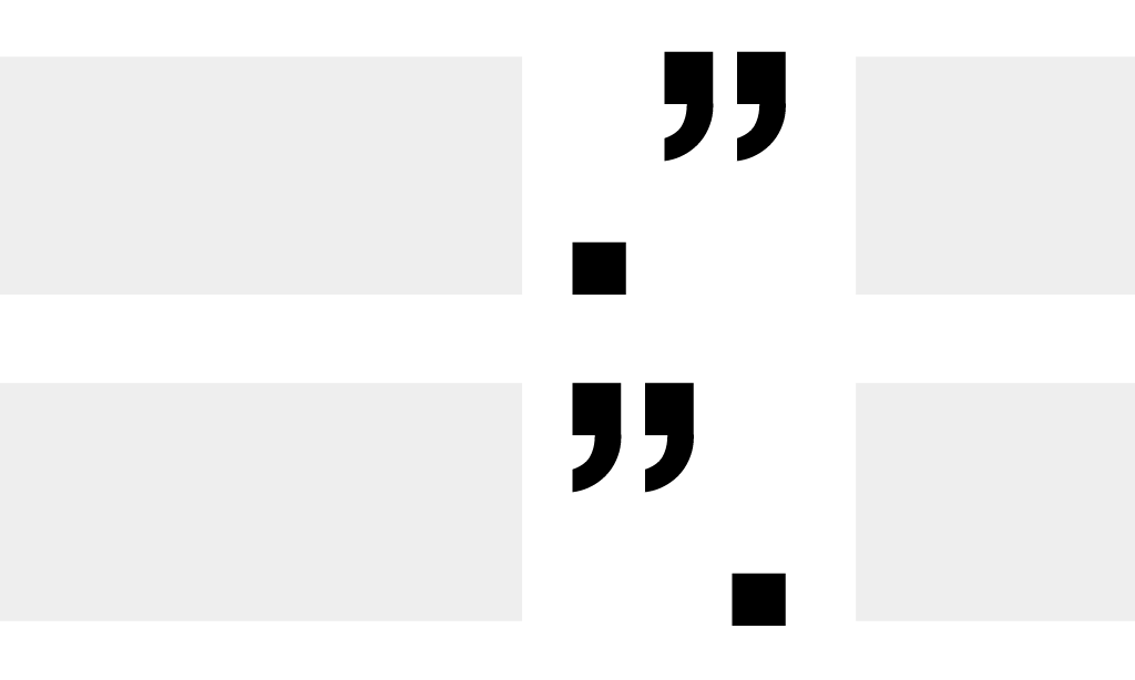
There is a great article over on Slate talking about something that has bothered me for quite some time, punctuation inside quotations.
The article does a great job of breaking down the arguments for and against the convention. I am firmly against the practice, but because it is so established, it isn’t likely to change any time soon.
There was one section of the piece that really captured my attention, and that was the fact that the original reasoning behind the choice was made for aesthetic reasons. Now the designer in me should be somewhat proud of a choice like this. From a typographic perspective, the choice was made to avoid creating a gap in the appearance of the line, and I very much respect the idea of improving the appearance of text.
The problem for me is that the aesthetic choice ruins, in my mind, the effectiveness of a quotation. Punctuation is not a part of the quotation, and therefore to include it within the quote marks ruins the sanctity of the quoted words.
When I was much younger, I remember reading a quote in a BMX magazine where a rider summed up his feelings on looking “cool” while riding as, “function before fashion.” Basically, something should work first before you worry about how it looks. The same holds true for design, typography, and everything else I do.
Before we start worrying about how a website or a sentence looks, we need to make sure it functions properly. In the case of punctuation, quotes don’t work when unrelated punctuation is inserted, this should trump any aesthetic concerns.
I could craft the most amazing user interface anybody has every seen, but if it doesn’t work well, my design won’t help. Function before fashion.
