The design process is often defined not only by what was used, but by what wasn’t.
During any design project, rarely is the first concept ever accepted without modification. The process for designing Reality Ministries’ new site was no different.
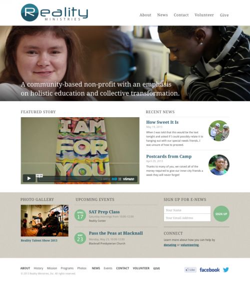
Round 1
 This was my first attempt at a design. The look is clean and functional, but there was a feeling that we could do better. This design also lacked the energy we wanted to display for this client.
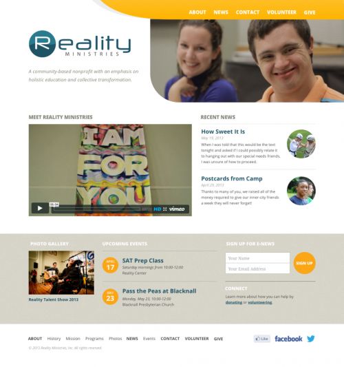
Round 2
 With this round I wanted to keep a lot of the whitespace found in the first round, but try to inject more energy with pops of vibrant color and dynamic shapes. The energy level was still a bit low here, and we also wanted to try something a bit edgier for the next pass.
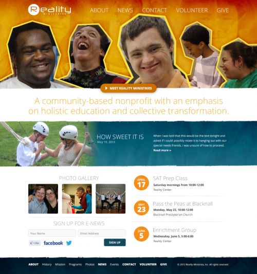
Round 3
 The goal here was to create a collage look, which doesn’t really work unfortunately, but the application of textures and torn edges really brought some of the content alive.
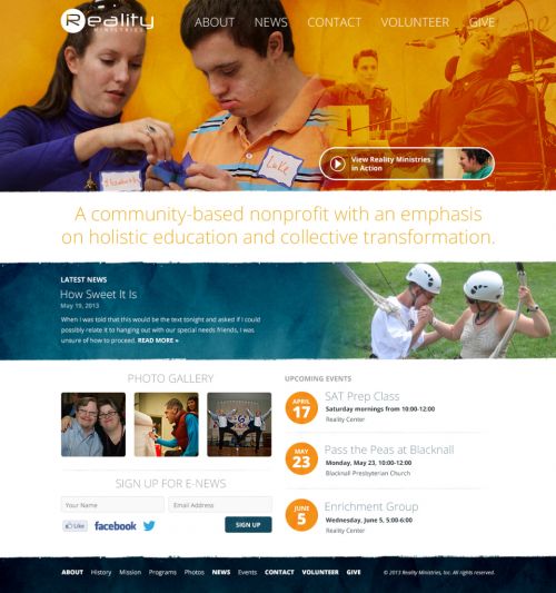
Round 4
 This is the draft that was approved. The banner was simplified quite a bit, but a lot of the coloring and section treatments remained from the previous round.
Looking at the final solution, it’s often easy to think that no other solution could work as well as what’s there. However, looking back at the previous versions, it’s obvious that the final design wasn’t the result of any one brilliant leap. Rather, it was the result of iteration and refinement over several rounds that created something we were proud to show our client and the world.
