Readzi started life some time ago. The earliest initial mockups I could find were dated around the end of 2014.
At that time I was wrapping up a fairly ambitious Cordova application written in Angular, and I wanted to build something of my own.
My goal was to further develop some of my career related skills, everything from design to development to marketing. As to what to build, I started by asking myself a question, what do I do most on my phone? The answer, browsing feeds via a reader.

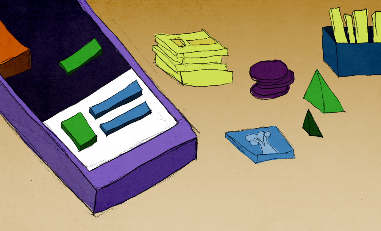
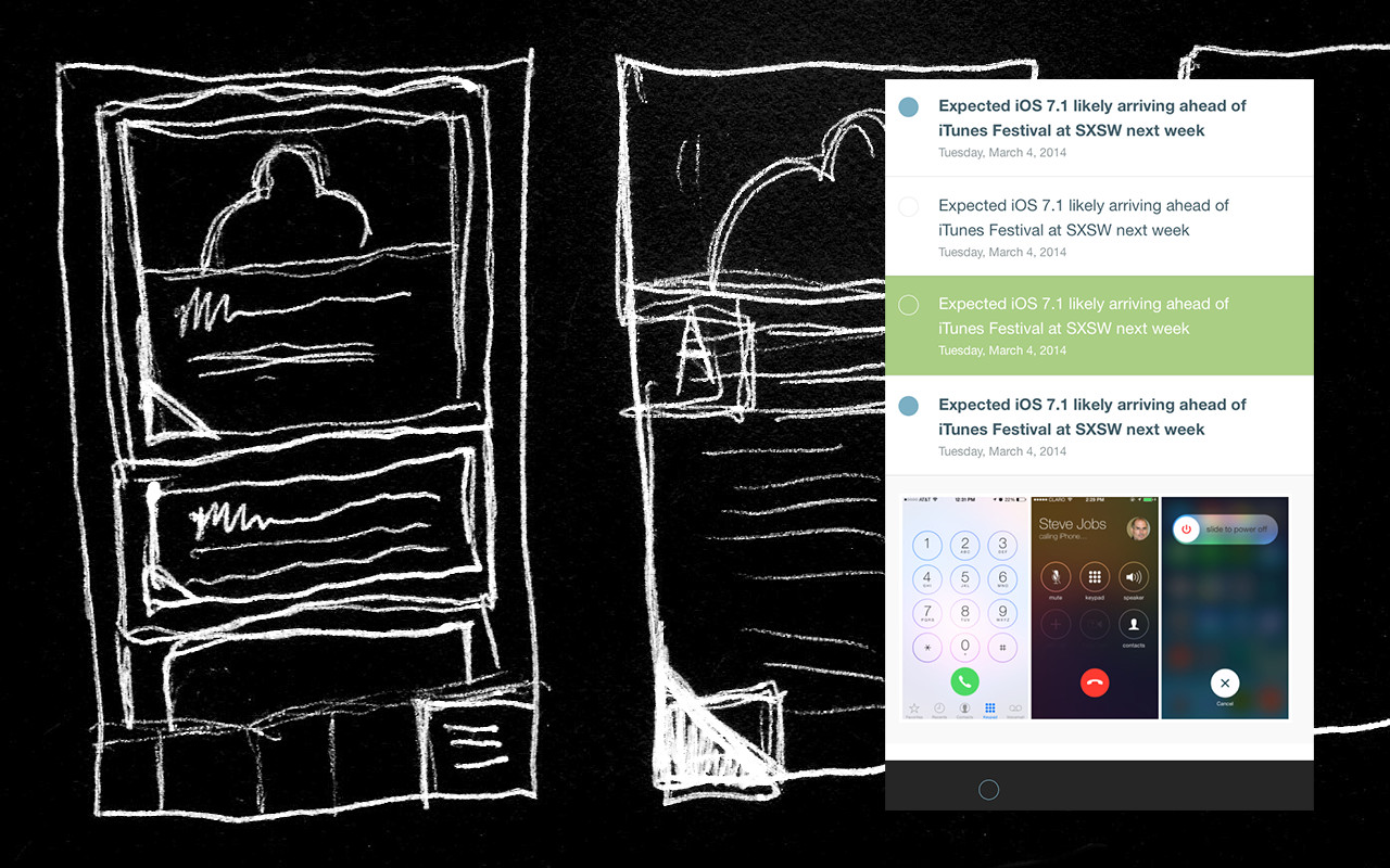
Early sketches and design for Readzi
My usage of RSS readers is fairly basic. I like to view feeds individually, so I can pick and choose what I want to look at. I like the workflow of browsing a section and marking it as read, because often times I will only partially browse a feed, and the act of manually marking things as read gives me more control over what I see next time. I also like being able to mark items as saved. I have an action set up with IFTTT that emails me any item I mark as saved, so after I’m done browsing on my phone in the morning, I can further investigate any interesting stories on my desktop.
I don’t use folders, categories, tags, or custom rules, so with this defined feature set in mind, I thought this would be a good project to tackle.
Platform
As I started prototyping my front-end, I had to decide what to do about the backend. Initially I looked into Meteor and its powerful WebSocket-based protocols, which would offer some exciting real-time possibilities. I built a simple form to send a query to the server, and then used the Google Feed API to pull down recent articles into the database.
This worked great, except that the Google Feed API had a deprecation warning on it, meaning it could disappear at any time, so probably best not to rely on it.
I also realized that I couldn’t expect users to know the address of an RSS feed, but it was likely that they knew the address of a favorite website. Taking that as an input, I could scrape the page, look for a feed url, then parse the feed. This worked fine, but introduced som additional concerns:
- How do I keep the feeds updated?
- What if a user wants to search by topic?
- Do I really want to categorize all of the web?
- If I do, how would I scale such an operation?
Eventually I had to ask myself another question, would I switch to a new feed platform just to try out an app? The answer was, no.
Ultimately I scraped the idea of running my own service. Instead, I decided to focus on being a client for the Feedly service. They had a developer API, a sandbox to experiment with, and instantly all of my platform related concerns disappeared. Feedly could run the back-end, and I could focus on the front.
Meteor
The only web application I had built at this point was with Angular, and prior to that had only used jQuery. My experience building with Angular was okay, but setting up the build process was tedious, and at the time I was reading about the Meteor platform and its Cordova integration and it sounded great.
Meteor is a full-stack platform, so they provide a server and the client. The solution they were providing was essentially a single command to build an application on the web, Android and iOS. I was focused primarily on mobile platforms, but being able to offer a web version at some point was a nice bonus.
I modified an existing OAuth plugin to work with Feedly and integrated it with Meteor’s account system. I used Meteor’s templating language called Blaze and built out a functional prototype of the application.
Eventually I got to a point where I was ready to start testing with some real data. Initially I was keeping my fetches from the Feedly API small, 10 articles at most. Once I got everything working the way I wanted, I upped it to the API’s limit, 1000 articles. Initially I thought somethign was wrong with my application, but no, it was working, performance had just ground to a halt. Animations became choppy, scrolling wasn’t smooth, things weren’t looking good. I could have spent some time here trying to fix the issue, but instead I decided to move everything to React.
Like I said before, I like reading news, so while I was building with Meteor, I also kept hearing cool things about React. The main thing I was hearing was that it was fast, so as soon as I hit that performance issue, I decided to move.
Initially integrating React with Meteor was hard, because this was prior to their official integration. I had a hidden folder with a webpack server running alongside Meteor that would output the build file so that Meteor could re-bundle it for the app. Eventually Meteor released an official integration with React and I removed this approach.
User Experience
The way Feedly’s developer API works is that you can develop on their sandbox without the need for any approval. To access real user data however, you have to submit your app for approval and a production key. After months of building, I was at a point where I was ready to submit my app to them, which I did, and then I waited.
I don’t have a record of how long I waited, but I do know it was long enough to feel discouraged. I had spent a lot of time trying to build out this application, only to get stopped right at the finish line. I wasn’t sure what to do at this point.
My API access was stuck in limbo, but there were other issues nagging at me as well. The app that I had built was a Cordova app, meaning it was essentially a browser displaying a web page. My performance concerns were gone with my move to React, but the user experience still left something to be desired. Pull to refresh and swipe to go back were two native features that I felt were essential to any list-based mobile application, and both happen to be very hard to achieve in a browser.
Ionic has a solution to both, but it’s Angular based, and I was already deeply invested and enjoying working with React. Framework7 has also managed to achieve both, and I ended up moving a lot of my application over to it. The downsides were that it is designed mostly as its own system, so it has to be initialized and routed in a particular way. What I ended up with was mix of Framework7 startup code and React components trying to parse out variables from the Framework7 router. This wasn’t a bad solution, just a little quirky.
I felt stuck again. I knew enough Javascript to build a simple application, but had to ask myself another question, would I want to pay for an app with a subpar user experience? The answer again, was no.
Luckily at this point the React Native project had matured quite a bit. Initially I was very excited about the project, and it was a major reason why I wanted to continue with the React ecosystem, but for a time it was iOS only. One of the few benefits of a webview based app is cross-platform support, so once Android support came, I really wanted to test it out.
Unfortunately I still didn’t have API access at that point, so instead I built HNZ, a Hacker News client. This is a far simpler app than I was trying to build with Readzi, but it had an open API I could use for free, so I was able to build and release it without any hurdles.
Structure
In December of 2015 is when I got an email from Feedly with my production API key, hurray! At that point I had just put version 1.0 of HNZ and I knew that Cordova wasn’t going to cut it anymore, I had to rebuild my app on React Native.
React Native has a developer experience that is equally as enjoyable as Meteor’s. A few simple commands and you are building and outputting native views via Javascript.
Swipe to go back and pull to refresh were now free, but I had another problem, application structure. In Meteor I had access to minimongo, a query language I could use on local collections to get results and automatically re-render components when those results changed. This meant that I was primarily just using React, and having parent components access data in order to re-render their children.
With HNZ I also just used React, but instead had a single parent container that held all the state, so all the children would re-render as needed. This worked okay for that app, but Readzi had a lot more state to manage. HNZ had items and those items had comments, and that was about it. Readzi had posts with unread and saved states, feeds with unread state, and a user account with logged in and logged out state that had to be managed. I needed a better way to keep track of it all.
The most popular method at this time was Flux. Facebook had a reference implementation I got working, but for some reason would see occasional lag in the time I dispatched an action to the time I saw my component re-render. What I really missed was Meteor’s minimongo, so I also experimented with minimongo-cache and later with MobX. MobX is a particularly exciting project, but I think due to some of the quirks of how React Native’s ListView is implemented, had several second delays when re-rendering list items. I saw the same issue with Realm, which I also tried briefly.
Eventually I landed on Redux, which I am now using in the shipping version of the application. Much like React, the Redux ecosystem was one of the major selling points for me. When I added in redux-logger, all of a sudden I had a much better understanding of exactly what my app was doing. Redux-persist allowed me to remove several blocks of code where I was trying to do a similar thing myself.
Version 1

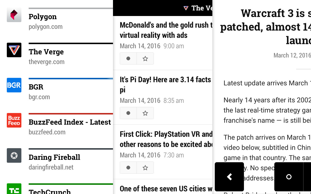
Version 1.0 screenshots
Version 1.0 of Readzi came out March of 2016 for iOS only. I was happy to have something out and in the store, but was less than thrilled with my execution of it. At this point the app had gone through so many platforms and frameworks that towards the end I felt myself just wanting to get it over with. I released it, but never promoted it. I never even set up the website for it. I just wanted to let it sit for a bit.
Android
With the iOS version out, I now wanted to make an Android version, so I fired up Genymotion and got started.
I purchased version 1.0 for myself from the App Store, and started to use it daily. Some of my concerns about the navigation patterns I set up started to bother me. The app just felt out of place. I had a native app that I had somehow made feel non-native.
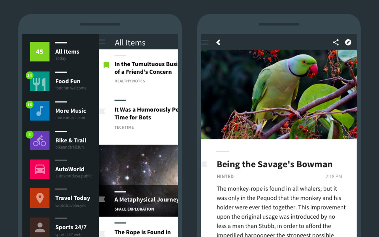
Back to the drawing board, I thought the Android version would be a good time for me to rethink some of my previous design decisions. For starters, I needed to get rid of the black and move to something a little friendlier. One of my early goals with the app was to try and simplify having both a header bar and a tab bar to show application functionality. Since my app only works in a single mode, feed browsing, I thought I could eliminate one or the other to provide more screen real estate for the content.
What this looked like in version 1.0 was some floating buttons toward the bottom of the screen, and a small, purely informational header bar. Unfortunately these solutions failed me on Android because :
- Android doesn’t need a back button.
- The space I’m saving by not having a tab bar is still wasted because the area between the buttons is mostly unusable.
So what to do? Android has an interesting navigation pattern called the Navigation Drawer that can be called in from any screen via a swipe or button tap. I liked this approach because it meant that a user could jump from a detail view to a different feed immediately, rather than having to navigate to the root of the stack in order to switch.
My first attempt at this was to use a Javascript-based approach in react-native-side-menu. In the simulator this approach seemed perfect, but once I put it on a Nexus 7, the performance was much worse. Thankfully the React Native project has a built in drawer layout for Android, which I dropped in and poof, amazing performance and responsivness.
The more I started re-thinking the Android experience, the more I realized the iOS version needed to be changed as well. I started with the Javascript-based drawer again, but later found react-native-navigation, an amazing project that uses native widgets to hold React Native components, meaning a few less things on the Javascript thread and a much more native feeling app.

Version 2.0 screenshots
The Future
Finally I’m at a point where I feel proud of the thing that I built. My goal now is to try and promote it where I can, maybe get some user feedback. Next I want to keep an eye on the react-native-navigation Android port because I’m so happy with the iOS portion, I want the Android version to feel just as nice.
I also want to start testing my app more. One of my initial motivations for this project was to learn more, and one area where I sorely need some improvement is how to create and run tests.
Beyond that, where else to go? Maybe more feed platforms? Additional Feedly feature support? The answer here is, I don’t know yet, but I’m excited to find out.
