One thing I enjoy doing in my off time is playing computer games (surprised?). Aside from the normal enjoyment derived from the gameplay itself, I also enjoy looking at how different game manufacturers approach the user interface.
A genre of game I find myself drawn to is called role-playing. Some of the hallmarks of the genre are inventory management, character advancement, quest-based gameplay, and the accumulation of experience points. All of these components add up to an interface that can require some fairly complex interactions.
For example, to equip an item, the game needs to provide visual cues as to where an item can be used. It also needs to provide information about the items properties and requirements. Depending on the game’s focus, the visual appearance of the character may need to be updated, or new animations employed to reflect the item change.
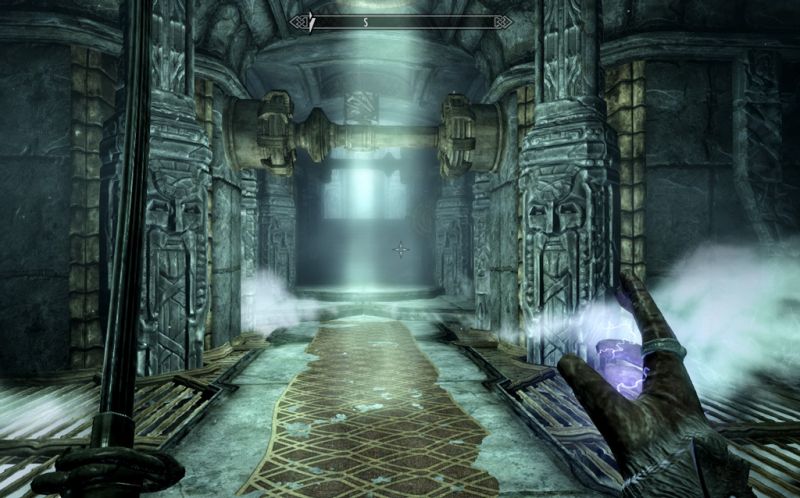
A game I have been playing recently is called Skyrim. The focus of Skyrim, aside from the previously mentioned genre trademarks, is that of exploration and immersion. The world in the game is immense, and much of one’s time playing the game is spent walking or riding around it.
The developers of the game came up with a clever way to maximize immersion, while still enabling players access to some necessary information. The screenshot at the top of this post shows a default exploration state. The players weapons are shown here, but they could easily be hidden as well. The only onscreen element here is a compass that points the player to their objective. Nothing else.
Compare that to another popular game, World of Warcraft.
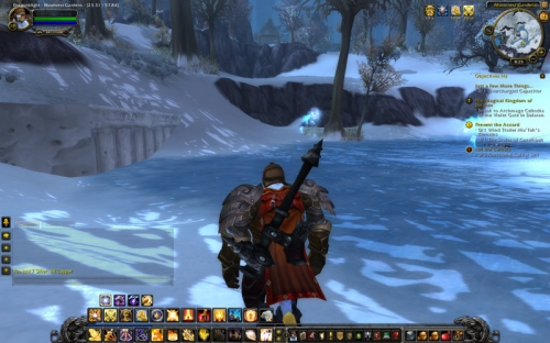
Here the developers have chosen to use the edges of the screen for numerous interface elements. Items include a social/chat window, a quest log, a spell/action bar, and several others.
These items are mostly all present in Skyrim as well, but they aren’t visible at all times. In fact, on-screen elements only become visible when they are needed.
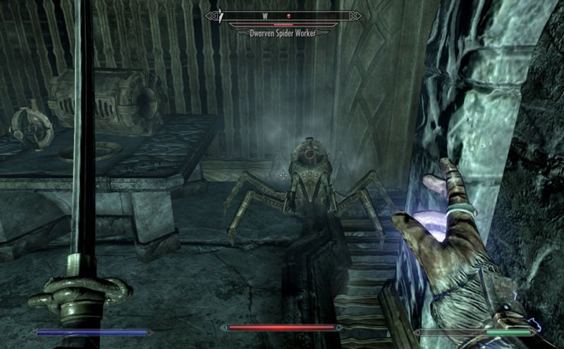
When in combat, new interface items fade onto the screen. Bars measuring various attributes of the character as well as the name and status of the enemy have shown up and remain visible until the action is over. When combat is complete, the additional elements will fade away again.
What I like about this approach is that items are only there when you need them, and in a setting where the goal is to have a player feel as much a part of the action as possible, maximizing the field of vision is a powerful technique.
This approach, however, is not any more or less correct than the approach the developers of World or Warcraft took. There, the goal is less exploration or immersion, in my opinion, but rather combat and character progression. With those stated goals, the interface should indeed focus on available attack methods, showing me my avatar at all times, and helping me track who or what I need to be looking for.
A further wrinkle to consider is that Skyrim needed to work with a console controller, a device with a limited set of buttons and controls. World of Warcraft was designed for a computer-based audience, a device with significantly more buttons and much more precise cursor control.
The lesson here is all about focus, make sure the interface matches the goals of a product. There is also something to be said for observing other industries to see how they are tackling design problems, even during game time.