A recent project has allowed me to explore the world of icon fonts, and what I have found has me excited at the possibilities.
An icon font is a set of vector images that take the place of letters within a font. For example, an icon font might have the letter “s” mapped to the image of a star. In the stylesheet of a website, we then replace the normal text font with the icon font to have that image show up instead of the existing text.
The primary thing we gain with this technique is resolution independence. From phones to tablets to desktops, text is drawn natively by the operating system. As more and more devices transition to retina-style displays, this saves us from having to generate multiple image sizes for these higher density displays.
This technique can also speed up loading time compared to images, especially since we only load the font once and can then use the icons all over the site. The icons also behave like text, so that means they can be colored and styled with any of the techniques we use for normal text.
There are, however, some considerations to keep in mind when exploring this technique. Because these icons are vector shapes, designers will not be able to fine tune the way the icons scale up and down. This can mean that detail in overly complex shapes gets lost at smaller sizes, therefore it is best to keep icons as bold and simple as possible.
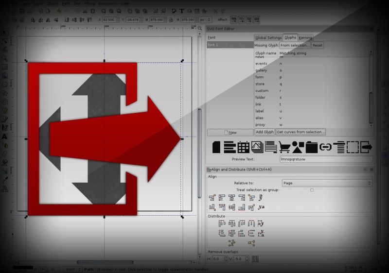
The work involved in crafting an icon set can also be substantial. I recently tried my hand at designing two separate icon fonts. One was for a web application where I designed over 70 icons for use throughout the site. There, the most important thing for me was to keep in mind a consistent design language, so that when the font actually got deployed, all of the icons look like they belong together. More recently, I thought it would be smart to wrap up some social network icons into a font. This would allow me to use one set of icons that could then be colored or styled differently depending on the site they were on.
Another consideration with icon fonts is semantics. For example, when I map the letter “f” to the logo for Facebook, I want to be sure that the letter “f” carries the same meaning as the word “Facebook.” This may seem like a odd consideration in such a visual medium, but it has implications for things like screen readers and accessibility, or in any situation where machines are attempting to extract meaning from your code instead of humans.
Many techniques rely on CSS pseudo-classes and generated content, others employ the “data” attribute for HTML 5, and still others have found a clever use for the “abbr” tag. I will be experimenting with all of these on my upcoming projects as they each have benefits, drawbacks, and varying degrees of support in the browser landscape.
For those that want all of the benefits with a bit less work, there are free icon fonts available for download as well as services designed for easy implementation and deployment.
The myriad of devices that now access the web along with the increasing display density of those devices has forced many web designers and developers to re-think some of our previous approaches to site construction. It is now much more advisable to offload as many visual effects as possible to the browser, and when it makes sense, use vectors as well.
The icon font is just one of the techniques we now have to craft consistent and high quality experiences on any device, at any resolution.